Comparison of Keyword "VICTIMS" to 4 Other Proposed Words
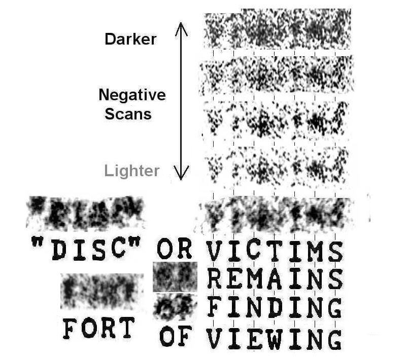
The graphic below shows the words "VICTIMS", "REMAINS", "FINDING", and "VIEWING" directly beneath the keyword in the third line of the Ramey telegram, seen by most people as "VICTIMS". All five comparison words are printed using 1947 teletype font to aid in the comparison.
Newer scans of the original negative at four different levels of brightness have also been added directly above print scan for comparison. The new scan is about two-thirds of the resolution of the print scan but sharper around the edges of the letters. Also the lighter scans help suppress film grain noise around the letters. The images have been rescaled to match the scan from the print.
People need to make their own judgments, but to my eye, the first letter looks very strongly like "V" and nothing like either "R" or "F" or "W" in three alternate proposed words. The real teletype font makes this quite evident. For comparison, the words OF that follows "VICTIMS", OR further below in the message, and FORT from FORT WORTH, TEX. from the next line has been included in the graphic to indicate what an "R" or "F" is more likely to look like.
The first letter also strongly resembles a "Y", but this can be eliminated by word searches and semantics, as no English 7-letter word starting with Y and containing some of the other obvious letters like the two "I's" makes any sense here. (Words like YIPPING, YIDDISH, etc.--see Word Search graphics)
The letter "E" is also a poor match in REMAINS for the second letter. The "G" in FINDING or VIEWING is likewise a poor match for the final letter when compared to "S". A relatively well-formed letter "S" from the word "DISC" two lines down is also included for comparison. The new added negative scans make the outline of the "S" a little more obvious than in the print.
The third and fourth letters in the word are less distinct (particularly the fourth, which is so light and poorly formed it could be anything), but note how the proposed "C" in VICTIMS would be a good match for a faint "C" elevated above the level of the other letters. Again the new scans make the outline of the letter more obvious while suppressing some of the surrounding noise. A similar elevated "C" can be clearly made out in the comparison word DISC to the right, and suggests a printing quirk of this particular teletype machine.
In contrast, neither the "M" in REMAINS, the "N" in FINDING, the "T" in WITNESS, or the "E" in VIEWING remotely resembles anything to be seen here in the third letter position.
The new scans also make the central dip a little more evident in the proposed letter "M" for "VICTIMS" and help distinguish the letter from the proposed 6th letter "N" in REMAINS, FINDING, and VIEWING.
The graphic also shows "tic marks" for the expected central positions of each letter, based on average letter spacing and even spacing between letters for teletype machines (nonproportional font). This can also help in determining likely letters.
Note, e.g., how the downstroke for the letter "I" in the second letter position is almost exactly where expected, whereas the downstroke of E" in REMAINS would be well to the left of the vertical stroke of the actual letter in the photo. Similarly, for the first letter in :REMAINS and FINDING, the downstrokes of the "R" and "F" are well leftwards of the central position of the actual letter.
Also the "C" in VICTIMS is centered where expected, whereas the dark splotch of film grain to the right, which I suspect various people are trying to fit to alternate interpretations, actually lies between letters, as the tic marks show.